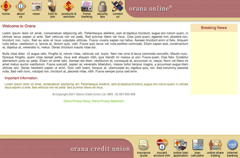
 This design was created for Orana Credit Union. Many years later, I still think it’s a beautifully elegant layout, with the vertically and horizontally opposed icons for primary navigation. The bottom ones are all verb enablers, leading to functions, whereas those on the top are for informational division
The entire design scales to any browser size, and the yellow space on the home page was an adjustable post-it note space for quick news pieces etc. It’s a frames based site, which I wouldn’t do these days, but given when the design was done, that was the sanest technology choice.