I just received my first attempt at printing a fine art book of The Metaning with Apple’s Aperture printing service. There were major problems which make Aperture a no-go for this project.
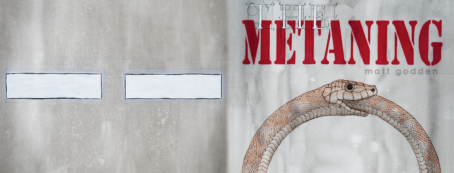
This is the artwork for the cover spread, taken directly from the pdf proof Aperture generates prior to ordering the book. As you can see, the front cover on the right, and back cover on the left, each have design elements which align to centre, and have equidistant left and right gutters.
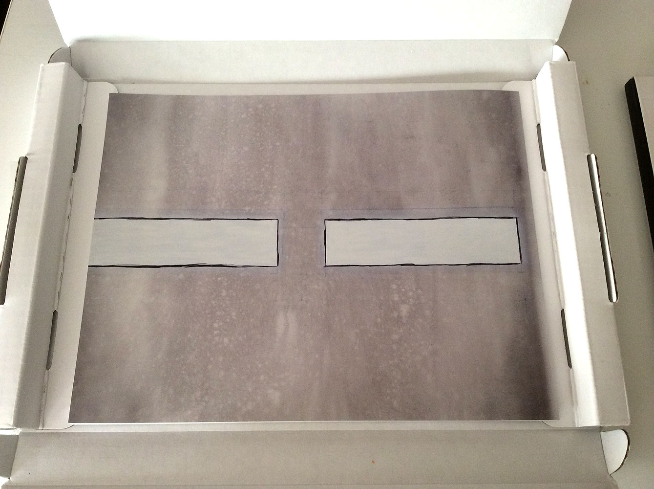
Here is what the actual printed product looks like. What has happened, as far as I can tell, is that the artwork was blown up in size, either to provide a bleed, or to accommodate the thickness of the spine. They’ve then centred the artwork to the front cover, which has meant all the horizontal growth pushes around to the back.
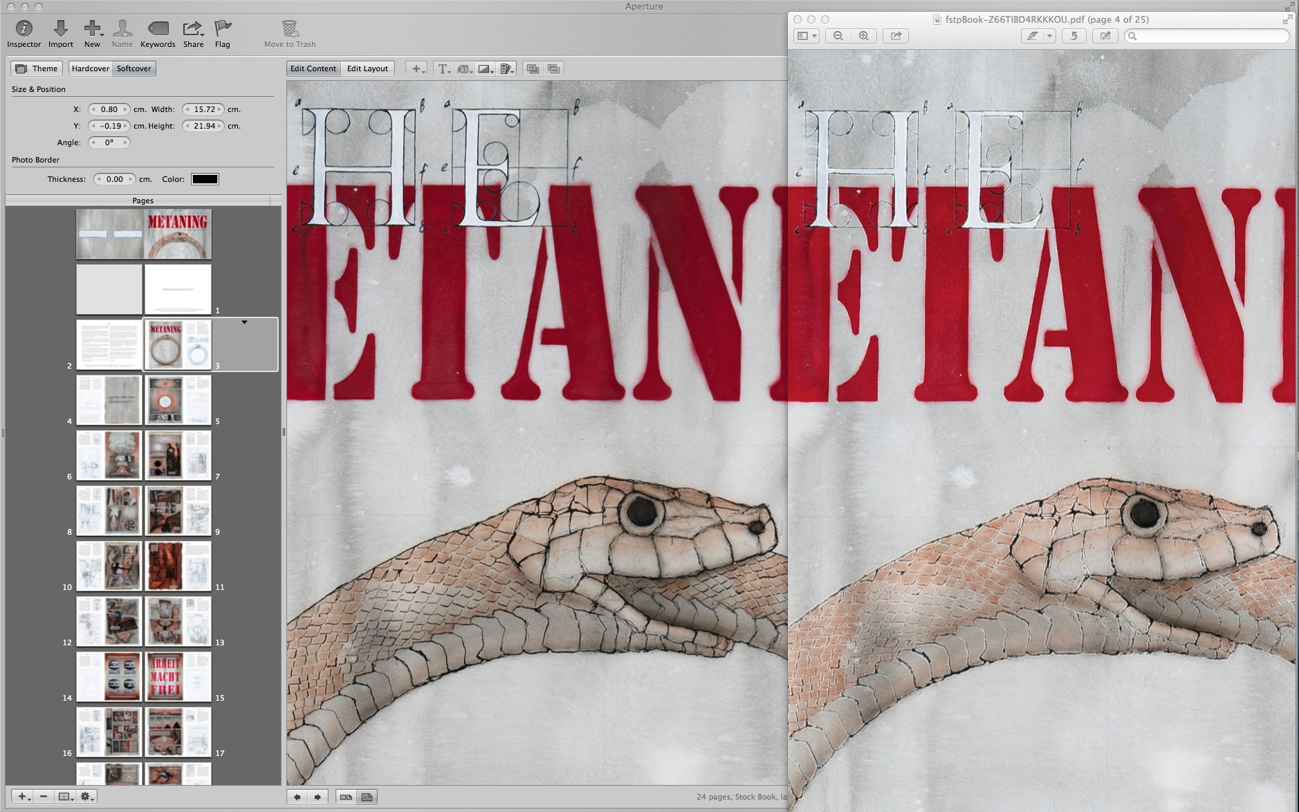
The other big problem is the compression used for the pdf files that get sent up to Apple’s print service. While it looks OK for photographs, when you have linework – high contrast changes from light to dark, the compression causes white fringing to occur. In this example, the image in the Aperture book maker is compared to its PDF output at the same size. As you can see, all of the lines have effectively lost their strength because they have their optical opposite right next to them.
Update: Further investigation of the problem shows a comparison of the PDF compression Aperture is using, as compared to InDesign, and Apple’s Pages app.