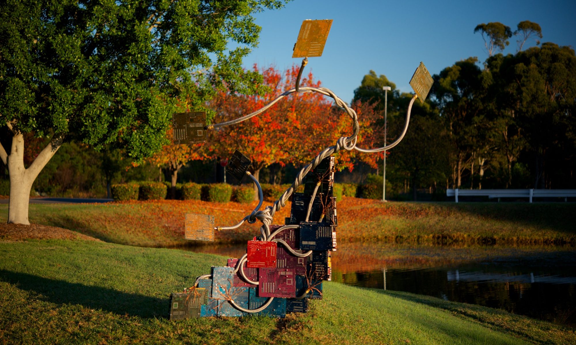
Manga Panel Design Theory

Introduction.

“Poor artists copy, great artists steal”

This quote, in various forms, including the less judgemental “Immature artists copy, developed artists steal”, has been (mis)attributed to many artists throughout history. It expresses a fundamental truth within any artist’s practice – that all technique is learned through imitation, but that imitation is only the first part of the process.

The difference between copied and stolen techniques comes down, in my opinion, to understanding not only the how (copying), but more importantly the why of a technique. To steal in art, is to take an idea, and be able to pull it apart and rework it to suit your own needs, without breaking the things that made the idea valid in the first place.

What does this have to do with comics? Well, comics is an artform which is not only built upon copying – witness the plethora of “how to draw (style) comics” manuals, but is also practiced, frequently, by people who are not formally trained as artists. In my experience, academic training is where the why mindset is nurtured.

This brings us to the point – the often misunderstood theory of panel design, especially as it relates to Manga, and most especially as it relates to Manga-style comics produced by westerners.

In western comics, the order in which panels on a page are read is often expressed along the lines of “left to right, then down”, sometimes with the addition of a “look at what’s happening in the panels if there’s any confusion”.

In the world of western languages, this may seem self-evident, after all, western scripts are universally(?) written in a left-to-right horizontal direction. Given the popularity of Manga, and the number of westerners for whom the graphical style of Manga is the dominant influence, this requires a deeper consideration. Unlike western scripts, Japanese is written from right-to-left, and may be either horizontally or vertically aligned. When a western, english language “manga artist” tells you the rule is “top right to bottom left, and always horizontal before vertical”, it becomes apparent that there are some fundamental misunderstandings about the design theory behind Manga amongst western practitioners.

Left to right or right to left?

When published in Japanese, Manga employs a right-to-left reading order, and broadly a top right to bottom left page reading direction. This is obviously the opposite of the way a western book is laid out and typeset. Japanese books are read right-to-left, because the Japanese language is written right-to-left. Starting in the origin corner of the page, the text you read progresses in the same direction as the overall page. Likewise, western comics, and western languages are written and read in the same direction.

When Manga were first translated and released to western audiences in the 1980s, publishers like Eclipse Comics, and translators like Studio Proteus would mirror-image flip the pages, so they could be read left-to-right. This also required subtle re-writes of the script, to ensure that spatial references (characters noting on which side an eye-patch restricts vision, for example) are updated. In the 2000s a counter-trend emerged, of translating text, but not flipping pages. This often extended to not translating or retouching the sound effect text, and was claimed to be in aid of producing a more “authentic” translation of the original. A cynic, or perhaps a realist, might suggest that it’s a bit convenient for “authentic” to coincide with “less work” and “cheaper”, especially when it produces a product that reduces the ease with which the reader can access the work.

Mirror-flipped or not, however, remains a controversy for translated Manga. When it comes to Manga-esque comics written in english, or any other left-to-right script, there should be no controversy – your comic should be read in the same direction as your language. Yet, as I mentioned earlier, there seems to be a (sub)culture of creating right-to-left Manga-styled books amongst western comics artists.

This is a perfect example of the copying vs stealing dichotomy: The immature artist copies the right-to-left reading order because that’s what Japanese language Manga does, the developed artist steals the design methodology, and understands that the reading direction is a function of that language in which it’s written, and is a means to the end of communicating the story, not an end in of itself.

“Authentic” Manga.

I’ve seen a defence of using right-to-left direction for english language Manga-like comics expressed along the lines of claims to authenticity – that Japanese Manga is right-to-left, so doing western Manga-style comics right-to-left is more “authentic”, and presumably, more correct.

This is where we get into the fraught world of cultural appropriation (and potentially identity politics) – where is the line drawn between adopting elements of the style of another culture’s art, and attempting to pass oneself off as an “authentic” practitioner of another culture’s art? Manga itself is a result of the traditions of Japanese drawing encountering Disney’s cartoons during the postwar occupation of Japan by American troops. The big eyes, the animation style – that’s yet another example of stealing in the artistic sense. Something from one culture was so thoroughly adopted and coopted by another, that it is now synonymous with the thief.

What’s happening with Manga produced by westerners is often not that, however. If you’re a westerner, you’re not an “authentic” Manga artist. What you produce will never be “authentic” Manga. A white Australian could learn everything there is to know about Aboriginal art techniques, learn the cultural stories, live with local Aboriginal groups – they will never be able to sustain a challenge to the authenticity of calling themselves “Aboriginal Artists”. In the Aboriginal case there’s also post-colonial and socio-economic outrages involved – so not to suggest that these two analogies are of equal severity, merely that they are structurally equivalent.

We have a long and sordid history of white artists passing themselves off with fake Aboriginal names in Australia, and this is the thing with authenticity – it derives from the artist, not the art.

Get to the point!

What is the actual theory behind panel layout in Manga? Here it is, in it’s simplest form:

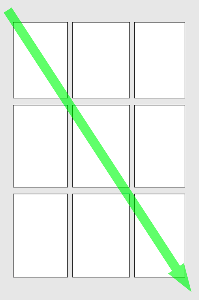
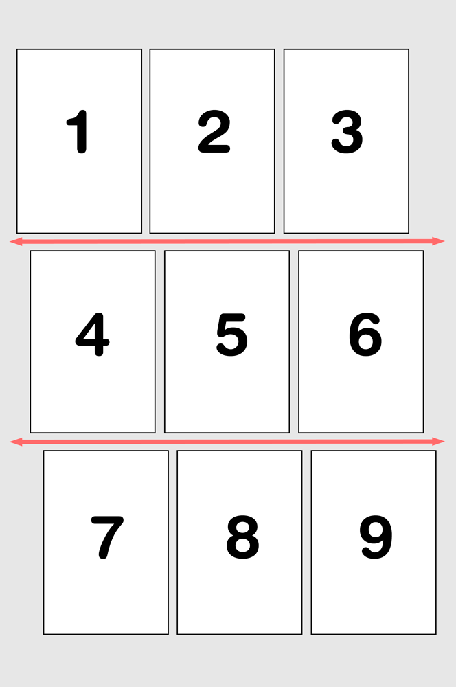
Scanning from Origin to Destination (top left to bottom right for western script, horizontally flipped for Japanese), find the first edge-to-edge gutter, and divide the page. Repeat recursively.

(Note: yes I appreciate the irony of a grid layout here, given my thesis is about the problems of grid layouts – read across then down.)

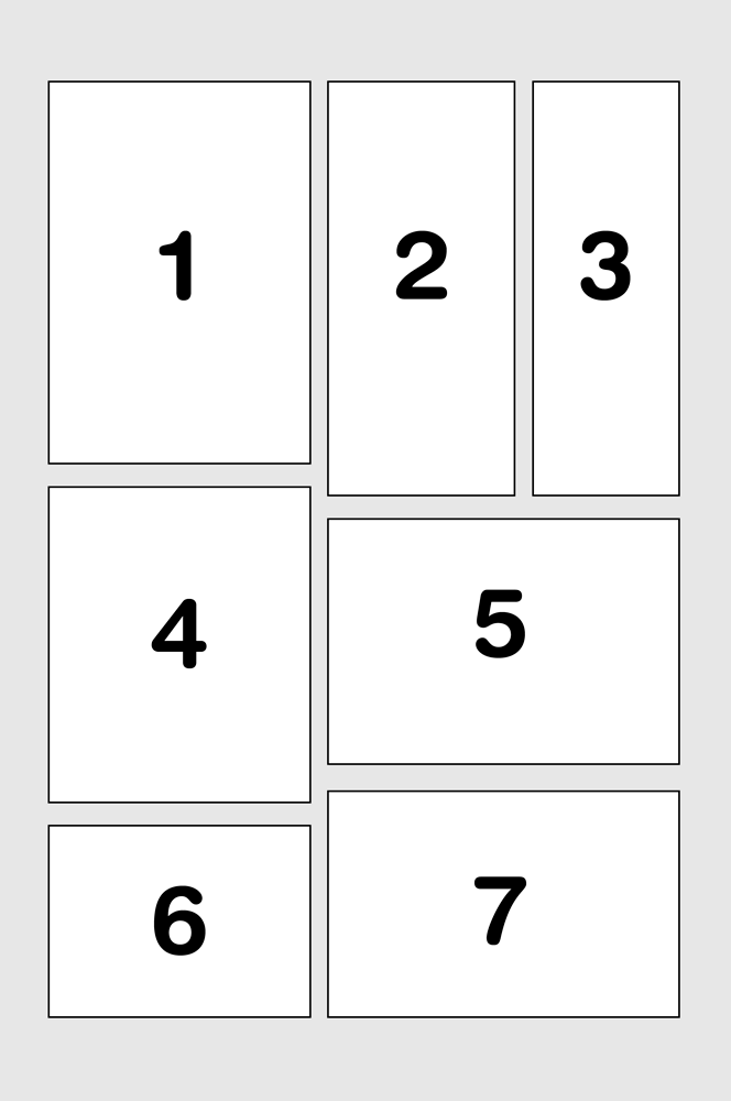
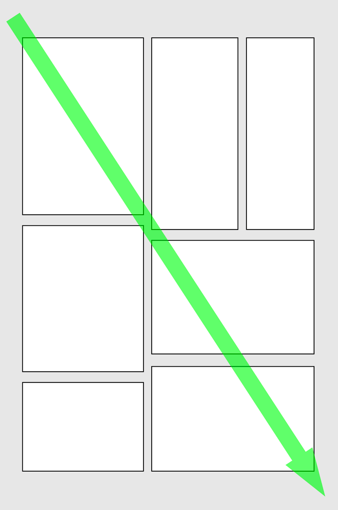
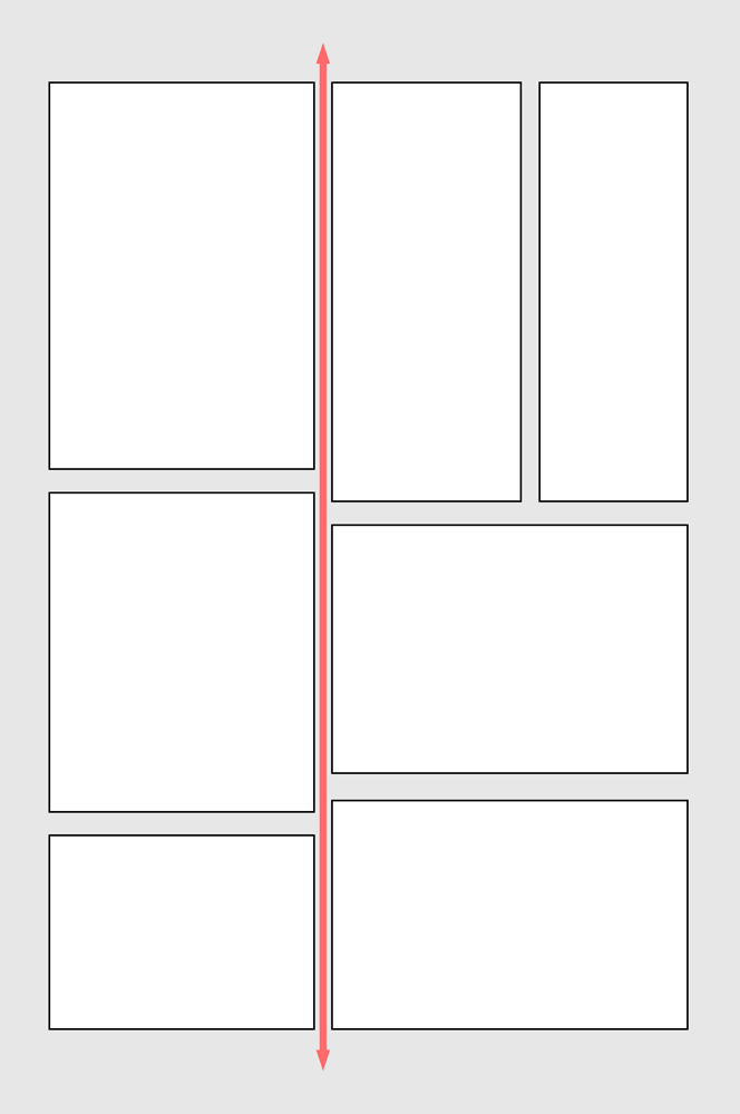
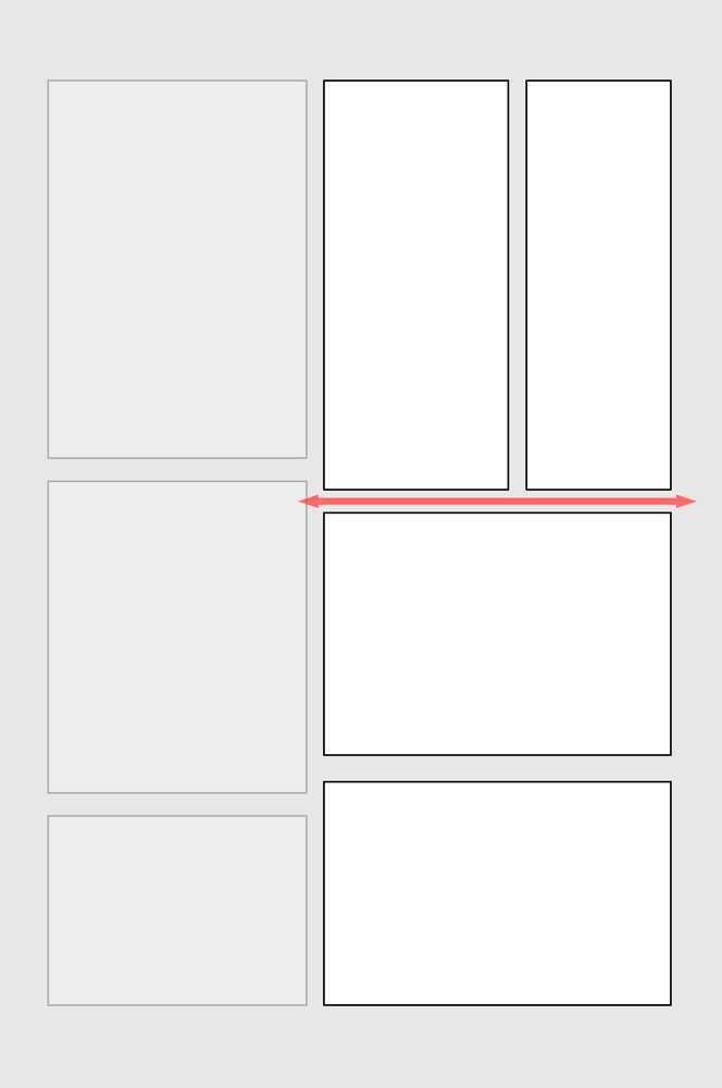
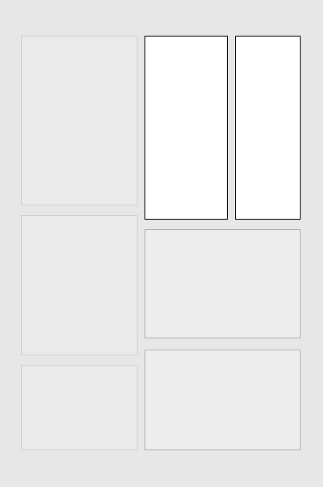
The Manga layout formula is inherent to the design. It’s a hierarchical rule, built on a consistent internal logic, independent of, and adaptable to any language. What this means, and what is a defining characteristic of Manga panel design, is that grid layouts, where edge-to-edge gutters intersect, are rare / forbidden.

Grid layouts are claimed to “work” (and I would argue they don’t actually work) in western comics because western script is always horizontal – it’s always across before down. That’s a problem as far as I’m concerned – the “rule” isn’t inherent to the design, it’s imposed from an external set of knowledge. Without the content of the panels, and without knowing that the language was written horizontally, there is nothing in the way western comics are designed which reveals the correct panel order.

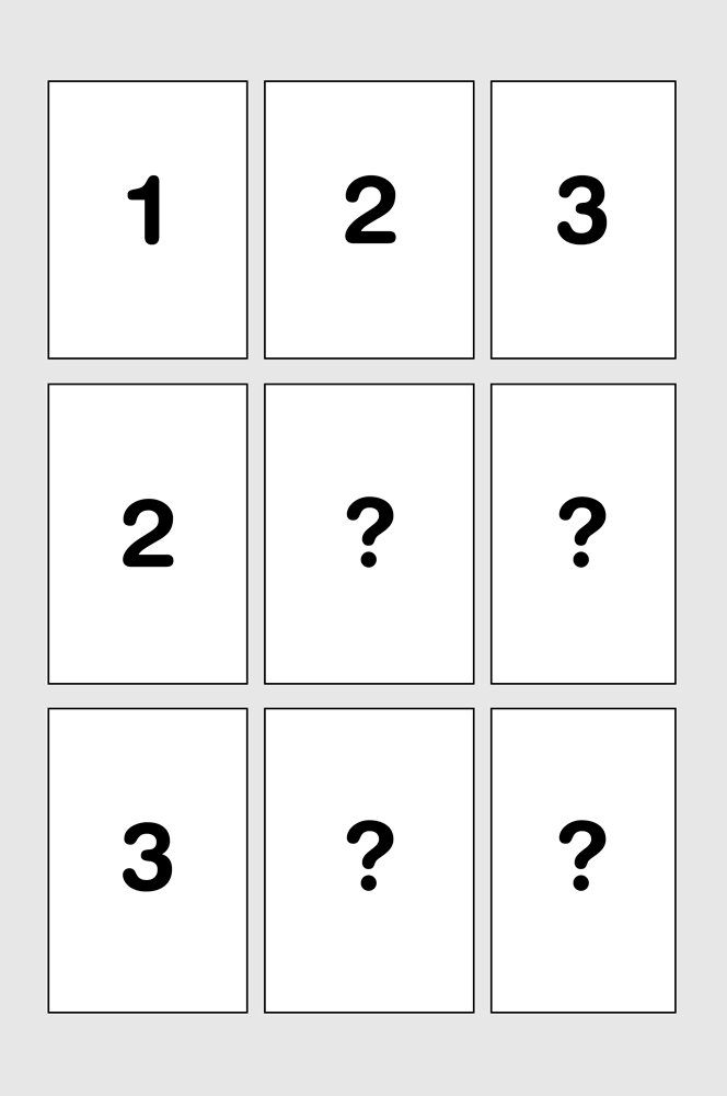
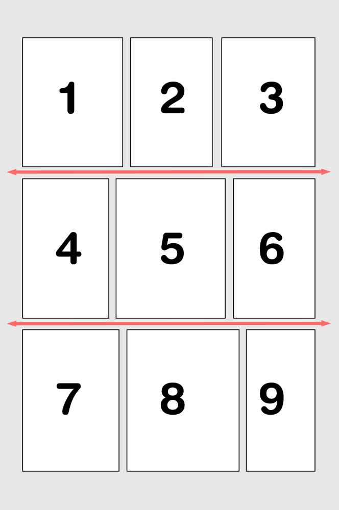
It is only the fact that people in western society are raised in a horizontal text culture, that makes the idea of “horizontal before vertical” seem like a natural, intuitive rule. Worse still, most people who would argue for grid layouts have probably been reading comics for so long, that they are unaware of having internalised that arbitrary rule.

“I want equal sized panels to communicate the experience of equally spaced, equal-length moments in time.”

Ok, try this:

But what about an artist’s personal vision? What if an artist really likes the symmetry of the grid? Why should an artist follow these rules?

At the end of the day, a comic page is about communicating the events depicted in the panels. That is the ultimate goal. A panel layout is the user interface for that goal, and when the artist’s personal desire for aesthetic expression conflicts with clear, unambiguous readability, it is their responsibility to get over themselves, and put the reader first.

An Essay on Australian New Wave Cinema

The period 1970 to the mid 1980s is often called the “Renaissance of Australian Cinema”. Discuss the ways this period can be considered to be a Renaissance through the construction of identity and nationalism? A list of suggested films includes: “Walkabout”, “Wake in Fright”, “The Cars that Ate Paris”, “Sunday Too Far Away”, “The Chant of Jimmy Blacksmith”, “News Front”, “Mad Max I – III”, “Puberty Blues”, “Breaker Morant” and “Gallipoli”.

The Australian film renaissance, also known as the New Wave of Australian cinema, was a period in which some 400 films were produced over roughly 15 years 1. It was driven primarily by two government policies, which occurred sequentially. The first, was in the 1970s, when the Gorton & Whitlam governments established financing bodies, which would directly contribute to projects. The second phase occurred in the 1980s with the introduction changes to taxation law that encouraged private sector funding of film 2.

Continue reading “An Essay on Australian New Wave Cinema”

An Essay on Sub-Cultural Politics & Identity

Discuss the way in which a concern with the politics of sub-cultural identity and difference animates the work of an artist of your choice.

As Carol Hanish was paraphrased 1 with the title of her essay The Personal is Political, I would like to explore the way an artist examines the sub-cultural personal politics of those who self-identify within the Goth / Industrial subculture. In the spirit of the post-Modern denial of a natural or valid distinction between “high” and “low” culture, or of the arbitrary assigning of labels such as “good” and “bad” to these culture-forms respectively, and to do my bit, however small, to push back against the stigmatisation that comics and comics practitioners have suffered 2 at the hands of cultural and academic hegemonists. I will be basing my exploration on the work of American artist and writer Jhonen Vasquez, and in particular, his graphic novel work Johnny The Homicidal Maniac (JTHM) 3.

Continue reading “An Essay on Sub-Cultural Politics & Identity”

A Sculpture Essay

This is an essay for the Modernist Sculpture elective in Art History & Theory at the National Art School. It received a High Distinction result. There’s a few issues with it that were largely symptoms of the constricted word length – such as the description of European isolation not placing enough emphasis on it being artistic isolation, while Europe was in fact very connected to the rest of the world through trade and imperial power. I also had to cut a discussion of Modernist architecture from Frank Lloyd Wright onwards being a result of FLW’s encounter with Japanese architecture at the Chicago World’s Fair. So, with those flaws in mind…

Continue reading “A Sculpture Essay”

Unscarce Rarity.

This essay was produced for my Mechanical Image art history & theory elective this year, and is more or less the manifesto by which I produced and sell my Nervous Spaces prints. The essay got a distinction result, so I’m reasonably happy with it. Oh, it was also a topic I created, rather than one the lecturer set, and is heavily pruned to a word limit.

Essay Question: Does the digital process affect the concept of scarcity underying the sale of photographic prints, and how can photographers establish a “valid” scarcity in the era of digital printing?

Continue reading “Unscarce Rarity.”

An Essay on Modernism II

Following is the second essay I wrote on Modernism for Art History. It did even better than the first one, so here it is.

Question: Can Pop Art be considered as the precursor of post-modernism? Discuss with reference to at least three artists.

The great question for arts criticism in our era seems to be “what is post-modernism?”. Nearly every aspect of modern culture and academia seem to have their post-modern genre, however these fields may bear little actual relation to each other. Post-modernist philosophical arguments like that of Thomas Kuhn’s Paradigm notion would hold that there is no objective truth and that all viewpoints are essentially based on their own presupposed agendas. Neurologist Dr Steven Novella counters this notion in Neurologica 1.

Continue reading “An Essay on Modernism II”

17th Century Art History Essay

Art History & Theory essay from 2009.

How would you interpret Judith and Holofernes, David and Goliath, or other scenes of violent murder, both male and female, from the late sixteenth and / or seventeenth centuries. You should include works by at least three different artists.

The Catholic church is an edifice built upon the survivor guilt of every person who receives forgiveness for their sins. Through the manipulation of this guilt, the power structures of the church are maintained. An over-estimation of this power would not only destroy the Catholic church’s monopoly on theology in Europe, but lead to some of western history’s most beautiful, and bloodthirsty art.

Continue reading “17th Century Art History Essay”

An Essay on Modernism

Following is an art history essay from my second year core Modernism course. It seemed to do reasonably well in marking, so I figured I may as well publish it. The length restriction was 1200 words, and so as the marker rightly suggested, it can become a little point-like (what happens when you’re editing down).

Question: To what extent is modernism a response to the Industrial Revolution? Did it replace the classical style of pre-industrial Europe? In your answer you may refer to a range of practices, including architecture, ceramics and photography.

Modernism is a tacit realisation that the overwhelming direction of the arts since the beginning of the Renaissance had run its course. Sculptors had made stone look as much like flesh as possible. Painters had made the flat surface of the picture plane as convincingly deep as the horizon, and builders had replicated the Greek temple and Roman arch for everything upto the metaphorical garden shed. The time of illusion through technical dominance of materials was drawing to a close (along with that of the craftsman who wielded that dominance), and a new era of honesty and sincerity to materials and function was dawning. Modernism therefore, is both a response to and enabled by, the industrial revolution.

Continue reading “An Essay on Modernism”

on facial expressions

This entry was an article I wrote, which was published in the NSW Writers’ Centre magazine “Newswrite”.


Neil Gaiman’s groundbreaking Graphic Novel series The Sandman fills approximately eight inches of my bookshelf. The final major volume, The Wake, is a funeral for the main character, Dream. Characters from throughout the series are drawn to it, to make their eulogies.

In my life, I have attended three funerals. Two for grandparents, and one for a high school friend, murdered in the October 12 2002 Bali bombings.

I did not shed a tear at any of them.

The Wake is a book I read on my own, such is the unmanliness of the weeping it elicits from me.

Why is this? I grieve so utterly over this fictional character, that I feel his passing more profoundly than I have any real person.

We could of course argue that Neil Gaiman is a great writer, and that there’s something wrong with the way my head works. Both of these may be true. Since I’ve never had this strength of feeling while reading prose, I think there’s something important at play here, something about the nature of the graphic novel as a medium that writers should investigate.

That thing, I believe, is the function of empathy and sympathy, as communicated through body language and facial expressions. The ability to read, and share emotional experiences, and to communicate with strength and subtlety at a mere glance, derives from the degree to which these forms of communication are instinctive, or rather, processed at a subconscious level.

In writing Surfing The Deathline, I presented myself a challenge – a story told graphically, yet relatively lacking physical action, the traditional fare of comics. Without descriptive or internal narrative, I had to rely wholly on the physical “acting” of my characters to convey every emotional cue I wished to invoke in the reader.

For the graphic novelist, this narrative limitation can be a powerful tool. We can use body language and facial expressions to reach straight into the reader and wrench their emotions, bypassing the logical and contemplative higher brain functions. Once readers empathise with our characters, they are open to sympathise with our message.

Surfing The Deathline is a political and social commentary, just as H.G. Wells’ War Of The Worlds was an indictment of the British Empire’s treatment of native peoples. Hopefully, as a result, readers will be prompted to think about and question some of the directions in which our society is heading.

The themes I’m attempting to tackle are poverty, isolation, terrorism, geo-political power, oppressive government, suppressive media, the war on drugs, anti-ethical morality, machine intelligence and human obsolescence.

Thankfully, one of the strengths of Science Fiction has been to facilitate placing social commentary in a format that appeals to the masses. Good sci-fi always creates a universe dense enough that it has an interest for readers beyond the characters. I like to think of this world-building as the result of combining three basic paradigms; geo-political, technological and sociological. A world, a disruptive key technology, and the effects on the general populace.

In Surfing The Deathline, after losing a network war with a trading block comprised of the third world, the USA is sundered into three nations, one of which is a fundamentalist Christian theocracy. Europe, though racked with internal conflict, is again the ascendant power. The dominant technology is Machine Intelligence (M.I.), ranging from toasters that don’t burn bread, cars, automated factories and surgical expert systems, to the vast self-aware intelligences that are the broodstock for more mundane functional versions. Nowhere in any of this, are there humanoid robots. Socially, the trains run on time and have pro-government news reports screening in the carriages. Universities expel students if their research harms the reputation of their corporate sponsors, and sell student debts to collection agencies. Welfare payments are tied to tracking implants which exercise moral control over discretionary spending. Beer commercials screen next to news stories about harsher anti-drug laws and forced chemical detoxification for those caught using. The latest drug scourge is The Deathline, a mental accelerant. It’s considered an unfair advantage in the workplace. One of its side effects is that it can kill.

Unstable superpowers, uncontrolled technology, hypocritical leaders. Pretty farfetched, huh?

The story is about Eddie. He’s a homeless unemployed former M.I. researcher, kept out of work by a no-compete employment contract, who gets an opportunity to clear his student debts with a shady network cracking job. He has to go meet a dealer to score The Deathline in order to have a chance of success. They have a drug guru type chat about the nature of life, then Eddie returns to his campsite in the disused stormwater drains. Eddie takes the drug, and begins the job, in the course of which he discovers the awful truth about the disastrous events of his life.

The series of conversations that make up a large part of the key story events ran the risk of being a dull set of talking heads, the action finale being Eddie alone inside an enclosed hammock. Expressive physical acting, utilising hand gestures and facial expressions, was my solution.

Feedback has been overwhelmingly positive, with the books nominated in every local category of the Ledger Awards. Readers have commented specifically about their surprise and delight that in a visual medium, they were highly engaged by scenes of conversation.

These wonderful tools of physical communication are hard-coded into every reader, and they’re awaiting your characters’ performance.