Pop Will Eat Itself / Jim Bob / Caligula @ The triffid

If there was one thing I wish I could do with this review, it’s to show you what this gig looked like. From the back of the venue, a view over the silhouetted throng of fans, the band ripping it up in full flight amidst the colour and smoke, the giant spray-stencil banner in the background like an industrial-music altarpiece, and the repeated perpendicular structural ribs of the drum-vaulted corrugated iron roof, that formed a perfect semicircle over the crowd, catching and outlined by the light, creating such a precise repetition in linear-perspective from stage to circle, that Kubrick himself could have set the scene.

I’d LIKE to show you that.

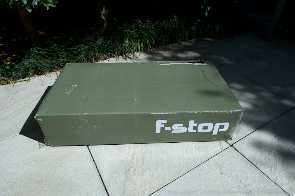
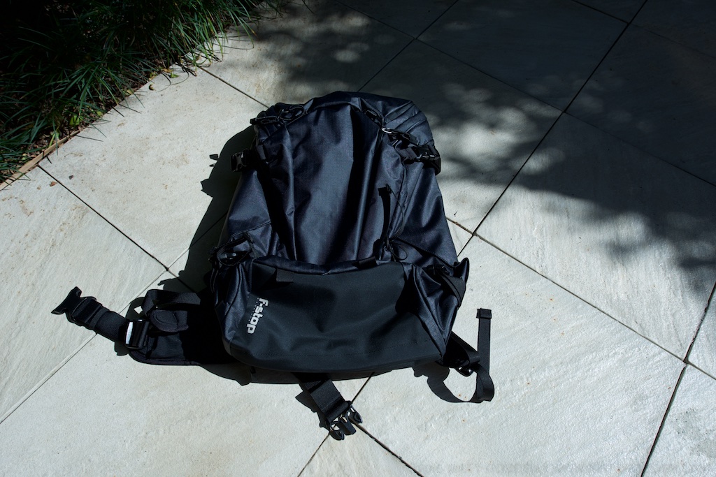
However, after buying tickets to the gig, driving 2 hours down to Brisbane, paying for a hotel room and parking for the night, phoning the venue and leaving a message asking them to let me know if there were any problems with cameras, packing seven grand worth of pro DSLR and some of the finest wide-angle optics ever made into a compact “body & lens only” camerabag, so that I could show you this near-religious vision of industrial music performance, I discovered at the door, that despite their website’s FAQ having no mention of this rule, The Triffid is yet another venue that has fallen victim to this idiotic policy of banning “professional” cameras from entry.

So, I can’t show you that.

Half the audience can block people’s view by holding up a cellphone, to take mediocre pictures that offer greater potential pixel detail than a “pro” camera could achieve 10 years ago. They can shoot video that would have required a steadycam-harnessed cine-camera that cost more than a luxury car 5 years ago, but apparently a DSLR, which will only block the user’s own view, is such a big problem, it requires blanket bans.

Sorry Ashley, but we missed Caligula (and the beginning of Jim Bob) walking back to the hotel to leave the gear – because again, when a venue has an unadvertised “no cameras” policy, you’d think they’d have enough of a clue as to have a proper security check-in situation with lockers, not “leave your camera here at the ticket booth” – an idea from which they retreated, when I told them what it cost.

Anyway, on to the music.

Jim Bob. Hmm, how to put this… Carter USM is consistently one of my favourite bands. They hold a deep sentimental spot for me because they were a high rotation band when I first got into the goth scene, and were on a couple of the played-to-death mix tapes I had back then. They’re also one of those bands that through poor timing, I never managed to see live. What Carter did, along with other contemporaries like the Poppies, even The KLF in their stadium house monsterworks, is construct huge, rich sounds, from so many dissonant sources, that you could just be overwhelmed by the music.

Jim Bob on his own with an acoustic guitar is not that. I don’t know what I was expecting – maybe the JB doing Carter tracks with a backing band, maybe with the Poppies actually doing the backing band stuff, I’m not sure. Even Carter’s acoustic tracks, like “The Man Who Bought The World”, have more in them. He joked several times about people being disappointed by the “is that it?” of it all, so I suppose he’s heard that reaction before.

In the end, it was an interesting performance, and thinking about it from the perspective of a soloist, doing acoustic protest songs, I’d have enjoyed it more if I was better prepared for that reality. As a positive, Jim Bob’s voice is still in great form. His anecdotes and chatter had the audience, myself included, laughing, but for someone hoping to see the indoor-nuclear-detonation opening of Surfin’ USM… maybe next time?

On to PWEI, or “PWEI Mk 2.5” as Mary Byker described them.

Holy freaking hell, they’ve so got it. Epic – there’s no other way to describe them. A big band, six musicians on stage – two vocalists, live drums, everyone looking like proper rock stars… except Graham, who in his grey, short-sleeved, button up collared shirt, looks like someone’s dad got lost in the wings, and ended up on stage. It’s adorable, and he looks like he’s really enjoying performing, so madprops, because nothing could detract from just how goddamn good, and how real, crunchy and live the band sounds.

It’s hard to say much more about them – how many superlatives can you come up with? Poppies fans in Melbourne, Sydney and Perth, you’re in for a freaking treat.

F-Stop Lotus (2015) Unboxing & First Impressions

Only the truly damned can know the suffering of those, for whom the perfect camera bag is a white whale obsession. Too big, too small, the wrong access, no hydration – we mutter this to ourselves, as those who love us climb the widow’s walk of Gear Acquisition Syndrome, and curse the sea for its cruel humour, for not just taking us and ending the pain.

Yes, buying a camera bag can be a fraught experience. This isn’t helped by the fact that the subject of this first look must be making its bags out of unicorn skin, with chickenteeth zippers, such is their rarity in retail outlets. I’ve just taken delivery of one of the first production run of the (now sold out) new F-Stop Lotus bags, so here’s an unboxing and first look.

Quick statistics – the Lotus is the smallest of F-Stop’s Mountain series packs. It’s a 32 litre shell with one main compartment, and side, front and top-of-lid compartments. Why would you get it? In my case – it’s compact enough to be a large daybag / everyday carry (with camera), but has a harness and numerous external attachment points, to enable it to be loaded up for lightweight overnighting.

Unboxing

The purchasing experience was, well, it was ordered & paid for on F-Stop’s website in late June, with a scheduled July delivery, and it arrived at the end of September. Once the delivery was scheduled, it arrived a few days earlier than forecast. As you can see by the photos, the delivered box isn’t exactly Apple-pristine in terms of packaging , but it did the job of protecting the contents. The drawstring F-Stop duffel bag, which an ICU I bought earlier also had, is a really nice packaging idea, rather than a plastic bag or similar.

My bag is the Anthracite colour. It’s black. VERY Black. Like “sucking all the light out of the room so you can only see it by its silhouette” black. All these pics were shot in daylight, metered with incident light, and colour meters, then shadow recovery in Aperture had to be turned up to the maximum to show the details. When you look carefully, you can see a checkered pattern, and it’s got this slightly rubbery texture.

The inside of the side and front pockets are of a lighter material, and don’t have the same rubberised feel to them. Given that the front pocket has a weep-hole, and is intended to be a place to stow wet outer layers, or snow tools, a question that arises is…

Moisture Ingress?

The best test I could think of was to get a bottle of water out of the fridge, run it under the tap, to simulate condensation, and then rotate it against the inside lining of the front pocket, while holding up a tissue to the other side, to see if any water wicked through. While the cold came across, as far as I can tell, the tissue itself is bone dry.

The inside of that front pocket is actually the pouch for an internal water bladder, so you might be wondering why I’m concerned – it’s mainly down to that pouch also being where an iPad or small laptop is supposed to sit, if you’re not carrying water internally. More on that later on.

ICU Fitting

What’s an ICU? F-Stop’s bag system is based around the camera being in a padded, removable bag, the Internal Camera Unit, which straps into the shell, to be accessed via the back panel. These ICUs come in numerous sizes, and styles. One of F-Stop’s weaknesses, however, is their pre-sale documentation. When I bought this pack, for example, there was nothing on their website to tell me which ICUs were suited to the pack. As a result, I made a best guess, and bought one which is listed as “compatible” but not “recommended”. The bag itself has a tag showing what they recommend, but this startlingly useful information is not available online.

In the Large Slope ICU, I can fit my full current kit, which comprises: Nikon d800, Nikkor 14-24g, 60g Micro, Spherical pano head, Manfrotto magnesium 3-way head, light meter, colour meter, some filters, and a few other cables, battery charger etc.

The way this is supposed to work, is you fold the top of the ICU under it, slip it into the bag, then attach the velcro tabs around the eyelets on the bag’s frame to hold the ICU against the back aperture. What I found is that the ICU didn’t naturally rest far enough into the bag for the tabs and eyelets to line up. Pulling the foam from the ICU lid went part way to alleviating the problem, but it still felt like I was forcing it to fit in place.

Now, it may be that this serves a purpose, ensuring the ICU is tensioned against the bottom of the bag.

The other problem is that when attached, the ICU is actually taller than the inside of the bag, so with the back unzipped, the ICU wedges the back open. Again, maybe there’s a logic to this, but my next ICU is going to be a shallow model.

There’s also a mystery eyelet at the top, which should be perfect for securing the top of a tall ICU, but there’s no matching velcro tab on mine.

Hydration

Hydration was one of the features which really caused headaches for me while looking around for bags. My previous (non-camera) bag, by Camelbak, is more of less the gold standard for this. The bladder is kept in a sealed, insulated compartment, centred on your spine. Looking around at camera bags, hydration was either absent, or fixed on one side. I wanted the freedom to shift water-weight depending on whether I had a tripod strapped to the side of the bag or not.

The Lotus’ external pockets are large enough that you can put a 2 litre bladder in any of them. There’s an internal pocket to hang a bladder in, but it shares duty as the laptop sleeve. I also can’t quite trust the idea of keeping water inside the pack with my electronics.

If there’s a criticism I can level here, and an improvement for the next version of the pack, it’s that hanging loops in the side and front pockets would provide a huge utility and flexibility boost, with no appreciable downside.

Compatibility

One of my favourite accessories, Thinktank’s Camera Support Straps, rely on the webbing rails on the shoulder straps of most packs. The Lotus lacks these, but thankfully, the webbing loop used for the built-in D rings is large enough that the clip for the strap can thread through it. As an added bonus, by rethreading the tag end back through, and up under the snack trampoline (there’s a springy pocket in the shoulder strap for snacks – I think that term is as good as any), it’s neater than on my previous pack.

The other great compatibility feature is the molle webbing on the inside of the back panel. This gives you the flexibility to mount other bags inside the Lotus, as shown here, a Lowepro holster bag attached with carabenas (which I’m doing while I wait for a local dealer to get stock of the shallow ICUs). It’s not quite as elegant as an ICU, but it still means the camera can be accessed separately from the contents of the top of the bag.

Conclusion?

It’s been a couple of days of carrying this around all the time. The Lotus is a bigger bag than I’m used to, but small enough that I can adjust to that, for the freedom to have a well designed bag to constant carry a couple of kilos of camera and lens. Also worth mentioning, the pockets in the lid, one accessible from the outside, one from inside, are spacious and majorly convenient for getting access to a lot of stuff without disturbing the inside of the bag. Further on the topic of the lid, it’s attached to open away from you when the pack on on your back, which means the zips can sit near your neck, away from potential pick-pocketing.

So, overall, my initial impressions are that this is going to be a serious piece of kit. It’s got its quirks (like the 14-24), but my gut feeling is that it’s going to be a tremendously enabling piece of gear.

If this article was of use, a donation would help support my projects.

Review: Adonit Jot Script

Opening disclaimer: I was provided with a “keeper” review unit by Adonit, and Mobile Zap Australia. Since this is a review of a handwriting-oriented device, try reading it in the original, handwritten form of the images below, but please note the edit in the typed version.

The Jot Script is the first of the new “pixelpoint” styluses from Adonit – the maker of my current favourite stylus – the Jot Touch 4.0.

It’s important to bear in mind that this device is primarily designed to be used with Evernote’s “Penultimate” software, and unlike the Jot Touch, it’s primarily a writing stylus. As you can see so far, it’s pretty accurate at capturing my godawful handwriting, which would put the average doctor’s scrawl to shame. The point being that despite how unreadable it may be to others, it’s perfectly readable to me.

Zoom View

Here is where we get to Penultimate’s real strength “zoom mode”. In this mode the screen zooms in and scrolls under the pen in direct relation to how fast you lay down new letters. The faster you write, the faster the page scrolls under the pen. This means you can slowly progress your pen across the page, and just hold your pen up off the surface for a second or two and let the program just drift a space in under the pen.

As you can see from this page as compared to the previous page, the text is far cleaner and more readable. What’s most interesting about this interactive design is that you can see the non-zoomed view in the background, greyed out so as to not distractfrom what you’re writing, but it keeps you aware of how far down the page you’ve progressed as you write.

All in all, it’s a pretty brilliant solution to the handwriting dilemma on the iPad, while avoiding the Newton’s trap of handwriting recognition.

The Pen Itself

While not feeling quite as sturdy as the Jot touch 4.0, it’s still sturdier than any of the pens offered by Wacom for their Intuous / Cintique (sic) tablets. The machined Aluminium barrel meets a plastic centre section where the on / off switch then transitions to a plastic grip area,

Important Edit: I just ran the grip area over my teeth (yes weird I know), and realised it’s actually the same metal as the barrel – the texturing in the surface had confused me as to what the material was – it feels quite different to the smooth metal of the barrel. This more or less negates any criticism of the product’s sturdiness compared to the Jot Touch.

and down to a metal tip. It feels lighter, and plasticer than than the Jot Touch, which is unsurprising, given its lower cost. Possibly my only major criticism is the choice to go with a AAA replaceable battery, rather than the internal rechargeable of the Jot Touch. But then again, these are the sacrifices that are inevitably made to bring a product in within a certain budget. My hope would be that the new Jot Touch with Pixelpoint can fulfil all the tasks the script currently fills, enabling users to carry just a single pen.

It should be noted that I’m left-handed, and that may haveand effect on the performance of the product. But as you can see from the past few lines the pen is quite capable of running writing, for those who refuse to print.

Conclusion

What the Jot Script provides is a fantastic environment for handwritten note taking that can be faster than a keyboard for quick – err, jotting of ideas. It has a major strength that text and drawing can be integrated thusly: (note look at the final gallery image)

One thing to watch out for is that drawing smooth curves can result in stepping as you can see here. But again this seems to not have any effect on handwriting.

As you can see in the top left corner, this is largely a result of the speed at which the lines are drawn. Fast avoids the stepping.

This is a device which does what it claims to do, and shows off the potential of the new generation of fine-point styluses Adonit is moving towards.

If this article was of use, a donation would help support my projects.

Review: Brydge+ Keyboard

Opening disclaimer: I was provided with a “keeper” review unit by Brydge Keyboards.

My first laptop style device was an Apple eMate 300 – a NewtonOS based touchscreen laptop. Following that were a couple of generations of PowerBooks, before I moved to Mac Minis as my primary computing platform. However, the memory of the experience of using a touchscreen laptop stuck with me throughout my PowerBook days. While the Windows ecosystem seems to be jumping on the bandwagon of integrating touch into all computers, Apple has remained resolutely against it.

The argument proffered is that fatigue from holding ones arms up to a monitor – “gorillla arms” – makes touchscreens unsuited to desktop computer use, and since Apple’s laptops are desktop computers in a different form factor, no touchscreen for them.

To me, the laptop can be a fundamentally different device to the desktop, insofar as the screen is mere inches from the user’s hands, rather than the full arms length of an iMac or standalone monitor. That should allow for some different ideas about the ergonomics of these devices.

Using an iPad with an external keyboard has been a thing since day one. Apple even launched the iPad with a keyboard dock accessory. Most keyboards are in the form of a folio, or as a slab with a slot to prop the iPad at a specific, set, angle. The Brydge line of keyboards is something quite different – a keyboard with hinges which grip your iPad and make it function in the same way as a standard laptop screen.

The history of the Brydge is an interesting one. Originally started as a Kickstarter project, the company quickly met its funding goals, and moved into production. From here things appear to have become problematic – with customer service not appearing to be able to keep up with sales. Brydge was recently purchased by a trio of Singapore-based Australians, who have embarked on a program of upgrades to sales & customer response systems, and establishing local distribution centres in major markets. For orders in the US, UK or Hong Kong they’re claiming to be able to ship an order within 24 hours of it being placed. They’ve also knocked about a quarter off the prices of the two top models. The unit I’m testing, the Brydge+ With Speakers, has dropped from $199.99 to $149.99, for example. They also have a speaker-less version of the Brydge+ for $139.99 in the brushed aluminium, and $99.99 in polycarbonate.

The Brydge+, like the entire current range, is designed for the second to fourth generation full-size iPads. The hinges on the keyboard have removable rubber linings, which suit the various thicknesses the devices have come in. While it’s not strictly designed for it, you can see in the photos here that an iPad Air in one of Apple’s leather Smart Cases will fit in the iPad 3/4 hinge size. Brydge say they’ve got a new model due out in the 4th quarter of this year, targeting the smaller form factor of the Air.

As a keyboard, the Brydge feels identical to Apple’s aluminium bluetooth keyboard in terms of depth of keystroke and “clickyness”, albeit a bit smaller in size. The top row has a number of function keys, including a very handy home key in the top left. One problem with the current models is that one or two of the keys have lost their function due to changes in iOS 7. Unless you need single key access to slideshowing your photo collection, this isn’t likely to be a major concern.

The angle and setup of the hinges is such that as you open the “lid” the screen bezel drops downwards relative to the keyboard surface, much the same as it does in Apple’s MacBook Pro line. As this happens, the angle of the keyboard is raised slightly as the cam-like outer curve of the hinge lifts the whole laptop off the desk. The hinges have a strong enough friction that they can hold the screen at any angle, even all the way back to horizontal, and the keyboard itself has sufficient weight to prevent the whole thing from overbalancing (noting that I’m using an Air, which is significantly lighter than other generations of iPads). What this means, effectively, is that this is a truly lap-top capable “laptop” solution for the iPad. There’s no straps, or kickstands, and the screen doesn’t have to sit a third of the way in to the device. You can have it flat on a desk, or sit in bed with your knees up and rest it on your thighs. Ergonomically, it’s a laptop, without a trackpad you can accidentally bump your thumb on while typing.

This model also has stereo speakers behind a centre aligned grille, which provide a diffferent audio experience to the built in speaker. To my ears they’re not as rich in bass as the Air’s speaker, though if critical audio quality is your thing, you’d probably want a dedicated set of speakers, or some good headphones. The speakers need to be paired separately to the keyboard, however they increase the battery drain.

In terms of battery life, Brydge claims the battery should last “several months” without the speakers in use. Mine arrived sufficiently charged that it hasn’t needed any charging throughout writing this review.

To conclude, the Brydge+ looks like an Apple product, and feels like an Apple product. It’s a top-notch piece of hardware – solidly built from durable materials, and possessed of the sort of heft that inspires a viscerally positive feeling in use. It does exactly what it claims to do – turns the iPad into a highly functional laptop. My personal choice would be the Brydge+ without speakers, although as someone who finds the feeling of brushed aluminium distractingly like touching something that’s electrically live, I’d also strongly consider the polycarbonate version.

If this article was of use, a donation would help support my projects.

Review: Adonit Jot Touch 4

Opening disclaimer: I have previously purchased a Jot Touch 4, and an original Jot Touch. The first generation model has unfortunately been made obsolete by changes in iOS 7, and so I was provided with a “keeper” review unit by Adonit, and Mobile Zap Australia, as a replacement.

As an artist, and one of them “Readers”, my kit for whenever I was out of the house day to day usually contained the following:

  • A4 Sketchbook.
  • Blue lead mechanical pencil.
  • Graphite mechanical pencil.
  • Eraser.
  • Paperbook novel.

When the iPad came into my life, I had the chance to consolidate, and the linchpin for all of this, and indeed the one missing part of the iPad puzzle that allowed me to adopt the platform, was the Jot Touch 4.

The Jot Touch is an iPad stylus which, uniquely when it debuted, provides pressure-sensitivity much like that of a Wacom tablet. It’s a genius solution to the problem of iPads not actually being pressure sensitive – the iPad natively tracks the location of the touch from the stylus tip, and the pressure information is measured in the pen, then communicated in realtime over Bluetooth.

To get the benefit of this, one needs a Jot enabled app, and my weapon of choice at the moment is ProCreate. If you click on the image above, what you’re seeing is a single tool – the 6b pencil, with no adjustments made during the entire drawing session. Everything there comes from the range of pressure available in the pen. It’s been a while since I did any repetitive drawing exercises , but the range of thin and thick strokes, variations from thin to thick and back, and ability of the pen to reliably keep up with my fast scribble drawing style mean that this tool is in every way a capable replacement for analog drawing implements.

Now, obviously a question that’s going to arise is what it’s like compared to an actual Wacom tablet. Adonit list the pen as recognising 2048 levels of pressure, much the same as the current desktop Wacom technology, and possibly more than many of the “Wacom enabled” tablet devices out there. For me, however it comes down to this – how good is your muscular control, that you could be that subtle in pressing on a pen? You can see some jitteryness and straight bits in loops in the image above – that’s entirely down to me and my less than rock-steady hands.

In terms of the hardware itself, The construction quality is utterly sublime. The stylus has a cylindrical aluminium barrel in charcoal or a deep lustrous red, and a rubber coated grip area with two buttons that can be mapped to control various functions. Between the buttons is a status LED, which glows red while charging, and green to indicate switch on, or charged. The cap screws off, and can be screwed onto the base when in use. Under the cap is the nib itself – a biro-fine metal tip ending in a clear plastic disc attached in the middle with a ball & socket joint.

This combination takes a moment of acclimation, and a bit of care when the lid is off. Once you start using it however, the ingenuity of the solution becomes apparent. The iPad has a minimum touch target size – around 5mm in diameter, and this has resulted in most styli being fat crayons, whose tip thickness obscures the point at which marks are made. The Jot’s clear disc, and fine metal tip mean that you can clearly see where your pen mark is happening, at least as clearly as you would with any analog drawing implement. In ProCreate, I have the brush outline switched on, and it’s clearly visible through the disc. So, you get direct visual feedback of how the pressure you’re applying translates into brush size – assuming that’s the dynamic you’ve got enabled.

This brings up an important point – because the iPad has a hard, flat, glass screen, and the Jot Touch has a hard, flat, plastic tip, a small bit of grit could potentially get caught between them. If you’re pushing down on the pen, there’s a risk of scratching your iPad’s glass. My recommendation is to carry a micro-fibre cloth, and then clean both the iPad, and the pen tip before each drawing session. Another option might be to try a screen protector if the cleaning solution is unworkable.

Back to the stylus’ construction, possibly one of the nicest features is the recharging setup. The end of the pen latches into a usb recharging dock which is about the size of a tiny USB thumb drive. It’s held in by magnets, strong magnets, which support the pen securely regardless of orientation – mine hangs in space parallel to the floor, the charger plugged into the usb port in the side of one of my displays.  The magnets also make docking the stylus automatic – get the end of the stylus close enough, and it will auto-align and pull into place.

The battery lasts long enough that I’ve never even come close to wearing it out – Adonit claims a month of “nomal use”. Like most of my devices, I plug it in each night, but you can happily leave the Jot in a bag for days without worrying about lacking power. I’m a big fan of built in batteries – the idea of having to use something like AAA batteries for a device is one of my pet peeves, so the Jot’s power setup really is a brilliant solution.

I’d like to close with a comparison – last week I received a Wacom Airbrush stylus, which I was intending to use to replace my broken Intuos4 XL Grip pen. It costs basically the same as the Jot Touch, and while it has a different featureset, in terms of build quality I think it’s reasonable to compare them. The Wacom pen is back with the distributor for exchange because all of the internals were so poorly fitted to the case that pressing the eraser in made the tip move out. It also felt fragile, hollow, squeezable under grip pressure, and cheap. The Jot Touch is utterly unlike that which we put up with from Wacom. It’s a true masterpiece of solid, functional, spare, Modernist industrial design, and a standard to which all objects one holds in one’s hand, should aspire.

If this article was of use, a donation would help support my projects.

Review: “kit: Bluetooth Keyboard Case”

Opening disclaimer: I was supplied with the test unit by MobileZap Australia, and allowed to keep it.

The Kit: Bluetooth Keyboard Case is a leather folio style tablet case designed to fit full sized tablets in the 9-10 inch range. It does so by having plastic clips which grip around the corners of the tablet, are connected to the case with elastic, and can therefore stretch outwards, accommodating larger form factors. In this case, I’m testing with an iPad Air, which unfortunately is too thin on its own for the clips to grip securely. You might want to look for a specific iPad Air case if you want to use that particular tablet. Alternatively, if you have one of Apple’s smart cases around your Air, I’m using the black leather one myself, it will bulk it out sufficiently for the clips to maintain a firm grip on the device, and the cover flap can close over your screen before you fold the keyboard against it.

The construction seems very sturdy, being stitched leather, with a soft suede-feel inside. The back of the case has a magnetically secured kickstand to prop the screen up while open, and the whole thing is kept closed by a leather flap and loop arrangement, which seems secure enough.

The keyboard itself is removable from the case, and held in with magnets, which makes it convenient to keep the single sheet instructions underneath. It can be removed and used without the folio, as the battery is within keyboard itself. It’s a reasonable keyboard, featuring about 5mm of travel and a full row of function keys. My only real criticism of it, coming from a Mac background, is that the right shift key is too small for the way I type (right pinkie finger used to activate shift). Given a perfect world, I would have preferred a smaller single line enter key, and a relocation & resizing of the End & right Control keys, respectively. That said, the keyboard is very usable, and I was able to comfortably code up a website while on the road. This is probably the biggest blessing of an external keyboard for someone like me, who actually really likes typing on the screen – the on-screen keyboard eats half the display, which is problematic when doing extended writing / coding sessions. I’m writing this review on the keyboard, and having the full screen to read back and ahead is so much better for keeping the context of the bit you’re writing at that moment in your head.

In terms of battery life, I haven’t been able to determine how long it lasts – though my habit with electronic devices is to charge them every night, I’ve been using this keyboard sporadically since December 18, and it’s still working on its initial charge. The manual lists 80 days standby, and 90 hours use. Charging is an area where I have a criticism of this product, however. Although the single sheet user manual states the product comes with a charger cable, my particular example didn’t include one. Thankfully I was able to find a charger for a bluetooth headset that happened to have the required micro-usb connector. Pairing and activating the keyboard is easy, with a built in key combo to wake the connection up after it’s been switched off.

All in all this is an effective and reasonably priced solution, which has a distinct advantage of not being tied to any particular model of tablet. If you’re in a situation where you want to provide standardised keyboard covers for multiple types of tablet, or have multiple tablets, but only want a single keyboard cover, this may be something to have a look at.

If this article was of use, a donation would help support my projects.