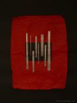
 Produced for the collage project. I wanted to try working big on this one, so it’s around A0 size.
The very first rough planning versions had the central black box and strips offset slightly higher of centre. I brought it back to centre for a sense of symmetry, but looking back at photos, I really prefer the off-centre version. I see why my drawing teacher used to keep telling me symmetry was something of which to be wary.
