 Longrunning doesn’t really seem to do justice to how long, how painfully long, the development of Surfing The Deathline has been. However, there is light at the end of the tunnel, and all going well, it’s not an oncoming train.
As we draw to the end of 2015, the main environmental lighting and toning is complete for part 4, and I’m getting back into something I haven’t really touched in a couple of years – the covers for 4, and now 5.
All this time, I had a holding image in place – a rough that was to form the basis of the final art, and a very specific idea of how the cover would look colour-wise. Once I got down to it, however, I just wasn’t happy with the direction it was headed – plus, I had a second book to contend with. Trying to keep all the different images in my head, so I could work out the flow of the whole series, was proving unwieldy, until I discovered something I hadn’t realised I could do previously – embed one InDesign document inside another.
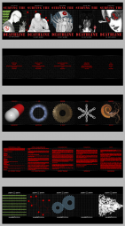
Now, the process works quite smoothly – page art is in Photoshop, and any updates made flow through to the master InDesign document where the whole book is assembled. That document is then embedded in a large composite document, pictured here, which racks up the front and inside front covers, frontispiece art, inside back, and back covers.
Getting that big picture made it far easier to do a number of things related to which book would get which cover image, and which set of intro words. The last two books flow like a single long book in many ways – much like 1 & 2, it was originally written as a single book, before being split and extended in the middle.
The upshot is that all the questions I had about this are settled. The final theme colours for the issues are green, red, blue, black, and white, respectively. It was a moment of grooving out to Nick Cave that cracked the problem of part 4’s cover art, furnishing me with an image that both matches the events of the book, and the red spot colour theme that carries through the series. Having a black theme colour against a black background is difficult, but workable and appropriate given what happens in that part.
