Matt Godden

human : artist

Bring content into view.

Category : geekery

Tech-specific articles.

Aperture Printing Problems

I just received my first attempt at printing a fine art book of The Metaning with Apple’s Aperture printing service. There were major problems which make Aperture a no-go for this project.

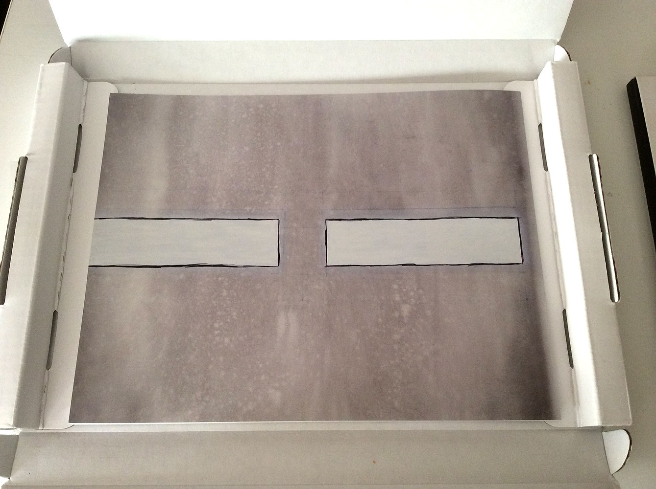
This is the artwork for the cover spread, taken directly from the pdf proof Aperture generates prior to ordering the book. As you can see, the front cover on the right, and back cover on the left, each have design elements which align to centre, and have equidistant left and right gutters.

Here is what the actual printed product looks like. What has happened, as far as I can tell, is that the artwork was blown up in size, either to provide a bleed, or to accommodate the thickness of the spine. They’ve then centred the artwork to the front cover, which has meant all the horizontal growth pushes around to the back.

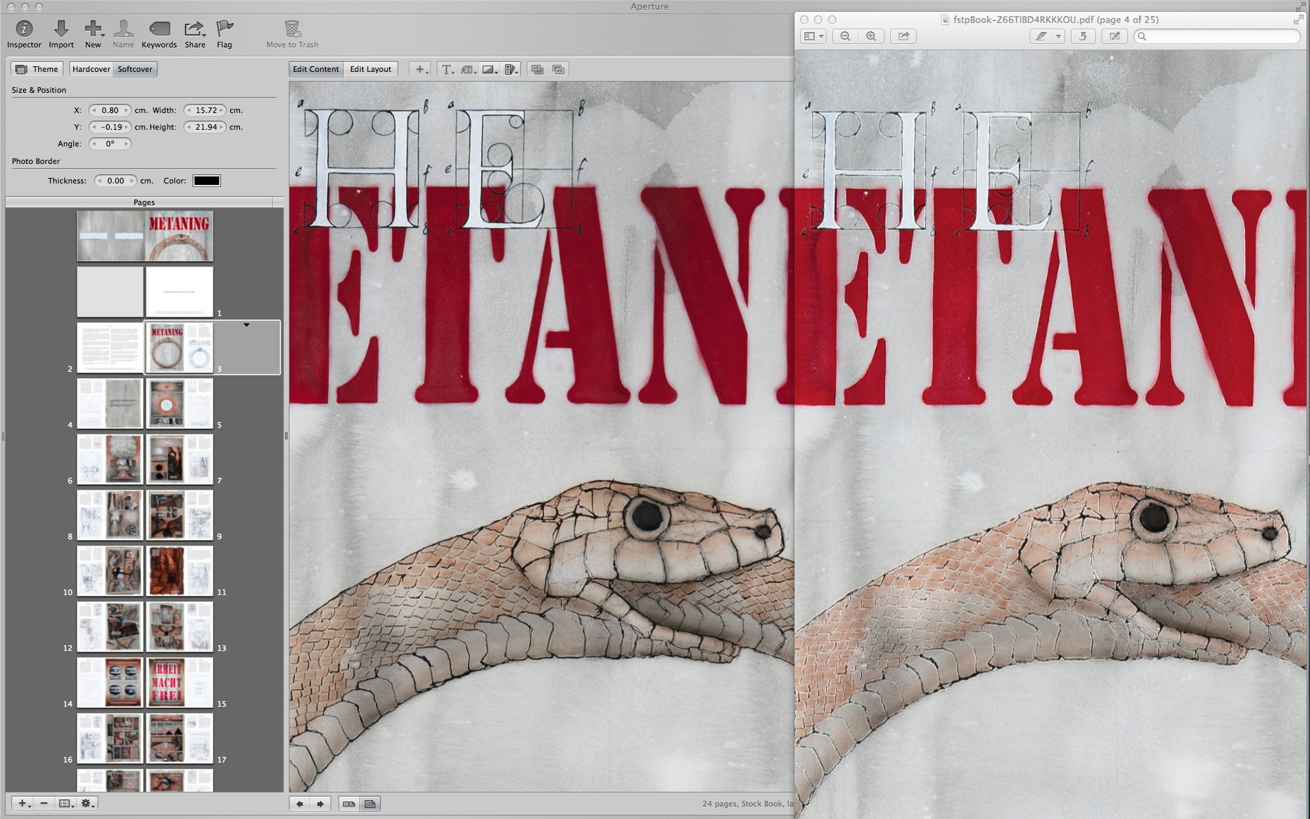
The other big problem is the compression used for the pdf files that get sent up to Apple’s print service. While it looks OK for photographs, when you have linework – high contrast changes from light to dark, the compression causes white fringing to occur. In this example, the image in the Aperture book maker is compared to its PDF output at the same size. As you can see, all of the lines have effectively lost their strength because they have their optical opposite right next to them.

Update: Further investigation of the problem shows a comparison of the PDF compression Aperture is using, as compared to InDesign, and Apple’s Pages app.


Review: Brydge+ Keyboard

Opening disclaimer: I was provided with a “keeper” review unit by Brydge Keyboards.

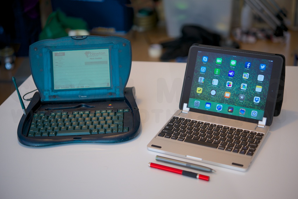
My first laptop style device was an Apple eMate 300 – a NewtonOS based touchscreen laptop. Following that were a couple of generations of PowerBooks, before I moved to Mac Minis as my primary computing platform. However, the memory of the experience of using a touchscreen laptop stuck with me throughout my PowerBook days. While the Windows ecosystem seems to be jumping on the bandwagon of integrating touch into all computers, Apple has remained resolutely against it.

The argument proffered is that fatigue from holding ones arms up to a monitor – “gorillla arms” – makes touchscreens unsuited to desktop computer use, and since Apple’s laptops are desktop computers in a different form factor, no touchscreen for them.

To me, the laptop can be a fundamentally different device to the desktop, insofar as the screen is mere inches from the user’s hands, rather than the full arms length of an iMac or standalone monitor. That should allow for some different ideas about the ergonomics of these devices.

Using an iPad with an external keyboard has been a thing since day one. Apple even launched the iPad with a keyboard dock accessory. Most keyboards are in the form of a folio, or as a slab with a slot to prop the iPad at a specific, set, angle. The Brydge line of keyboards is something quite different – a keyboard with hinges which grip your iPad and make it function in the same way as a standard laptop screen.

The history of the Brydge is an interesting one. Originally started as a Kickstarter project, the company quickly met its funding goals, and moved into production. From here things appear to have become problematic – with customer service not appearing to be able to keep up with sales. Brydge was recently purchased by a trio of Singapore-based Australians, who have embarked on a program of upgrades to sales & customer response systems, and establishing local distribution centres in major markets. For orders in the US, UK or Hong Kong they’re claiming to be able to ship an order within 24 hours of it being placed. They’ve also knocked about a quarter off the prices of the two top models. The unit I’m testing, the Brydge+ With Speakers, has dropped from $199.99 to $149.99, for example. They also have a speaker-less version of the Brydge+ for $139.99 in the brushed aluminium, and $99.99 in polycarbonate.

The Brydge+, like the entire current range, is designed for the second to fourth generation full-size iPads. The hinges on the keyboard have removable rubber linings, which suit the various thicknesses the devices have come in. While it’s not strictly designed for it, you can see in the photos here that an iPad Air in one of Apple’s leather Smart Cases will fit in the iPad 3/4 hinge size. Brydge say they’ve got a new model due out in the 4th quarter of this year, targeting the smaller form factor of the Air.

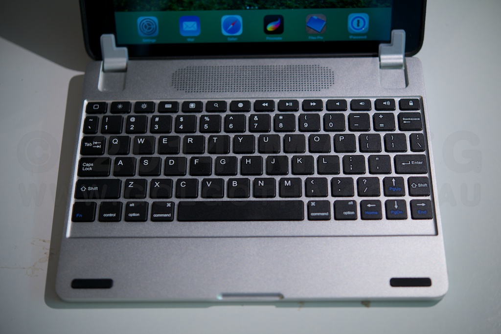
As a keyboard, the Brydge feels identical to Apple’s aluminium bluetooth keyboard in terms of depth of keystroke and “clickyness”, albeit a bit smaller in size. The top row has a number of function keys, including a very handy home key in the top left. One problem with the current models is that one or two of the keys have lost their function due to changes in iOS 7. Unless you need single key access to slideshowing your photo collection, this isn’t likely to be a major concern.

The angle and setup of the hinges is such that as you open the “lid” the screen bezel drops downwards relative to the keyboard surface, much the same as it does in Apple’s MacBook Pro line. As this happens, the angle of the keyboard is raised slightly as the cam-like outer curve of the hinge lifts the whole laptop off the desk. The hinges have a strong enough friction that they can hold the screen at any angle, even all the way back to horizontal, and the keyboard itself has sufficient weight to prevent the whole thing from overbalancing (noting that I’m using an Air, which is significantly lighter than other generations of iPads). What this means, effectively, is that this is a truly lap-top capable “laptop” solution for the iPad. There’s no straps, or kickstands, and the screen doesn’t have to sit a third of the way in to the device. You can have it flat on a desk, or sit in bed with your knees up and rest it on your thighs. Ergonomically, it’s a laptop, without a trackpad you can accidentally bump your thumb on while typing.

This model also has stereo speakers behind a centre aligned grille, which provide a diffferent audio experience to the built in speaker. To my ears they’re not as rich in bass as the Air’s speaker, though if critical audio quality is your thing, you’d probably want a dedicated set of speakers, or some good headphones. The speakers need to be paired separately to the keyboard, however they increase the battery drain.

In terms of battery life, Brydge claims the battery should last “several months” without the speakers in use. Mine arrived sufficiently charged that it hasn’t needed any charging throughout writing this review.

To conclude, the Brydge+ looks like an Apple product, and feels like an Apple product. It’s a top-notch piece of hardware – solidly built from durable materials, and possessed of the sort of heft that inspires a viscerally positive feeling in use. It does exactly what it claims to do – turns the iPad into a highly functional laptop. My personal choice would be the Brydge+ without speakers, although as someone who finds the feeling of brushed aluminium distractingly like touching something that’s electrically live, I’d also strongly consider the polycarbonate version.

If this article was of use, a donation would help support my projects.


Review: Adonit Jot Touch 4

Opening disclaimer: I have previously purchased a Jot Touch 4, and an original Jot Touch. The first generation model has unfortunately been made obsolete by changes in iOS 7, and so I was provided with a “keeper” review unit by Adonit, and Mobile Zap Australia, as a replacement.
As an artist, and one of them “Readers”, my kit for whenever I was out of the house day to day usually contained the following:

  • A4 Sketchbook.
  • Blue lead mechanical pencil.
  • Graphite mechanical pencil.
  • Eraser.
  • Paperbook novel.

When the iPad came into my life, I had the chance to consolidate, and the linchpin for all of this, and indeed the one missing part of the iPad puzzle that allowed me to adopt the platform, was the Jot Touch 4.

The Jot Touch is an iPad stylus which, uniquely when it debuted, provides pressure-sensitivity much like that of a Wacom tablet. It’s a genius solution to the problem of iPads not actually being pressure sensitive – the iPad natively tracks the location of the touch from the stylus tip, and the pressure information is measured in the pen, then communicated in realtime over Bluetooth.

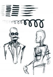
To get the benefit of this, one needs a Jot enabled app, and my weapon of choice at the moment is ProCreate. If you click on the image above, what you’re seeing is a single tool – the 6b pencil, with no adjustments made during the entire drawing session. Everything there comes from the range of pressure available in the pen. It’s been a while since I did any repetitive drawing exercises , but the range of thin and thick strokes, variations from thin to thick and back, and ability of the pen to reliably keep up with my fast scribble drawing style mean that this tool is in every way a capable replacement for analog drawing implements.

Now, obviously a question that’s going to arise is what it’s like compared to an actual Wacom tablet. Adonit list the pen as recognising 2048 levels of pressure, much the same as the current desktop Wacom technology, and possibly more than many of the “Wacom enabled” tablet devices out there. For me, however it comes down to this – how good is your muscular control, that you could be that subtle in pressing on a pen? You can see some jitteryness and straight bits in loops in the image above – that’s entirely down to me and my less than rock-steady hands.

In terms of the hardware itself, The construction quality is utterly sublime. The stylus has a cylindrical aluminium barrel in charcoal or a deep lustrous red, and a rubber coated grip area with two buttons that can be mapped to control various functions. Between the buttons is a status LED, which glows red while charging, and green to indicate switch on, or charged. The cap screws off, and can be screwed onto the base when in use. Under the cap is the nib itself – a biro-fine metal tip ending in a clear plastic disc attached in the middle with a ball & socket joint.

This combination takes a moment of acclimation, and a bit of care when the lid is off. Once you start using it however, the ingenuity of the solution becomes apparent. The iPad has a minimum touch target size – around 5mm in diameter, and this has resulted in most styli being fat crayons, whose tip thickness obscures the point at which marks are made. The Jot’s clear disc, and fine metal tip mean that you can clearly see where your pen mark is happening, at least as clearly as you would with any analog drawing implement. In ProCreate, I have the brush outline switched on, and it’s clearly visible through the disc. So, you get direct visual feedback of how the pressure you’re applying translates into brush size – assuming that’s the dynamic you’ve got enabled.

This brings up an important point – because the iPad has a hard, flat, glass screen, and the Jot Touch has a hard, flat, plastic tip, a small bit of grit could potentially get caught between them. If you’re pushing down on the pen, there’s a risk of scratching your iPad’s glass. My recommendation is to carry a micro-fibre cloth, and then clean both the iPad, and the pen tip before each drawing session. Another option might be to try a screen protector if the cleaning solution is unworkable.

Back to the stylus’ construction, possibly one of the nicest features is the recharging setup. The end of the pen latches into a usb recharging dock which is about the size of a tiny USB thumb drive. It’s held in by magnets, strong magnets, which support the pen securely regardless of orientation – mine hangs in space parallel to the floor, the charger plugged into the usb port in the side of one of my displays.  The magnets also make docking the stylus automatic – get the end of the stylus close enough, and it will auto-align and pull into place.

The battery lasts long enough that I’ve never even come close to wearing it out – Adonit claims a month of “nomal use”. Like most of my devices, I plug it in each night, but you can happily leave the Jot in a bag for days without worrying about lacking power. I’m a big fan of built in batteries – the idea of having to use something like AAA batteries for a device is one of my pet peeves, so the Jot’s power setup really is a brilliant solution.

I’d like to close with a comparison – last week I received a Wacom Airbrush stylus, which I was intending to use to replace my broken Intuos4 XL Grip pen. It costs basically the same as the Jot Touch, and while it has a different featureset, in terms of build quality I think it’s reasonable to compare them. The Wacom pen is back with the distributor for exchange because all of the internals were so poorly fitted to the case that pressing the eraser in made the tip move out. It also felt fragile, hollow, squeezable under grip pressure, and cheap. The Jot Touch is utterly unlike that which we put up with from Wacom. It’s a true masterpiece of solid, functional, spare, Modernist industrial design, and a standard to which all objects one holds in one’s hand, should aspire.

If this article was of use, a donation would help support my projects.


The Other Wrist

Occasionally, I like to engage in a bit of recreational tech prognostication, and with the current hubbub over what Apple will do next, it seems there’s a considerable slice of the world who thinks the next big thing is a “smart” watch.

This is dumb.

Brutally dumb.

Apple, in its current aesthetic is a premium product company. If they are going to make a product, it will feel like the most materially luxurious version of that product. Hence the metal and glass design language they’ve adopted over the past few years.

Here’s the thing, most people don’t wear watches any more. They’ve become an enthusiast device, and the premium end of the market is mechanical. Mechanical to the point of fetishising that very nature, so that whole new classes of designs and movements are being invented, creating even more baroque ways to enable accurate progression via purely mechanical means. The joy of the modern watch is to wear a mechanical engine on your wrist.

That leaves the other wrist. Whatever Apple is working on, will be something you’d keep on your wrist while NOT wearing a watch. It will not be a portal to your phone, it will probably not have a screen at all. My bet, it’s going to be a motion recorder, like fitbit, which allows you to log and stream all your movement for interactivity like a wiimote.

More importantly, it also acts as a wearable passcode key for all your devices. Your mac unlocks when you approach, and locks again when you leave, your phone and tablet unlock when you pick them up, and it talks to iBeacon-using smart house devices (ie those who will fill the void left by NEST becoming a pariah for joining Google) around your house for smart house integration. iBeacon will be the new feature for home environment and control devices, the way AirPrint became a must-have for printers. It’ll be waterproof, and charge inductively.

There is no “how do I tell the time on my wrist” problem to be solved. There is no “how do I get a small music player for while I’m exercising” problem to be solved. There is no “I want to see my email but not take my phone out of my pocket” problem to solve, no actual people think like that. All the “problems” current smart watches “solve” were invented post-hoc purely to justify the concept of the “smart watch”.

Whatever it is, it won’t solve a glaring problem you, or anyone else thinks you have. It will solve problems that were so constant, so low level so much a part of the background friction of your life, that you never recognised them for what they were.

Update March 10th:

Here’s an article on an Apple patent for for doing one of the things I mentioned.


Review: “kit: Bluetooth Keyboard Case”

Opening disclaimer: I was supplied with the test unit by MobileZap Australia, and allowed to keep it.

The Kit: Bluetooth Keyboard Case is a leather folio style tablet case designed to fit full sized tablets in the 9-10 inch range. It does so by having plastic clips which grip around the corners of the tablet, are connected to the case with elastic, and can therefore stretch outwards, accommodating larger form factors. In this case, I’m testing with an iPad Air, which unfortunately is too thin on its own for the clips to grip securely. You might want to look for a specific iPad Air case if you want to use that particular tablet. Alternatively, if you have one of Apple’s smart cases around your Air, I’m using the black leather one myself, it will bulk it out sufficiently for the clips to maintain a firm grip on the device, and the cover flap can close over your screen before you fold the keyboard against it.

The construction seems very sturdy, being stitched leather, with a soft suede-feel inside. The back of the case has a magnetically secured kickstand to prop the screen up while open, and the whole thing is kept closed by a leather flap and loop arrangement, which seems secure enough.

The keyboard itself is removable from the case, and held in with magnets, which makes it convenient to keep the single sheet instructions underneath. It can be removed and used without the folio, as the battery is within keyboard itself. It’s a reasonable keyboard, featuring about 5mm of travel and a full row of function keys. My only real criticism of it, coming from a Mac background, is that the right shift key is too small for the way I type (right pinkie finger used to activate shift). Given a perfect world, I would have preferred a smaller single line enter key, and a relocation & resizing of the End & right Control keys, respectively. That said, the keyboard is very usable, and I was able to comfortably code up a website while on the road. This is probably the biggest blessing of an external keyboard for someone like me, who actually really likes typing on the screen – the on-screen keyboard eats half the display, which is problematic when doing extended writing / coding sessions. I’m writing this review on the keyboard, and having the full screen to read back and ahead is so much better for keeping the context of the bit you’re writing at that moment in your head.

In terms of battery life, I haven’t been able to determine how long it lasts – though my habit with electronic devices is to charge them every night, I’ve been using this keyboard sporadically since December 18, and it’s still working on its initial charge. The manual lists 80 days standby, and 90 hours use. Charging is an area where I have a criticism of this product, however. Although the single sheet user manual states the product comes with a charger cable, my particular example didn’t include one. Thankfully I was able to find a charger for a bluetooth headset that happened to have the required micro-usb connector. Pairing and activating the keyboard is easy, with a built in key combo to wake the connection up after it’s been switched off.

All in all this is an effective and reasonably priced solution, which has a distinct advantage of not being tied to any particular model of tablet. If you’re in a situation where you want to provide standardised keyboard covers for multiple types of tablet, or have multiple tablets, but only want a single keyboard cover, this may be something to have a look at.

If this article was of use, a donation would help support my projects.


A Mountain Lion Calendar Reminders Solution

So there’s this bug in the calendar app in Mac OS X 10.8 Mountain Lion, where even though the reminders preferences are set to “None”, when you create new events they’ll show a reminder for the day before at 9am.

Having gone quietly mad trying to figure out the problem (there seem to be several solutions listed online relating to editing .plist files, none of which work), the situation and solution is thus:

When Calendar.app is started up afresh, there are 3(4) calendars in it:

  • Home
  • Work
  • Birthdays
  • (Reminders)

These have no reminders set in them, however any new calendars created will have the 9am day before default for any events created even if the preferences are set to none.

The solution is to create any new calendars, then create a new event, and open the inspector to you can see the event’s properties. Open the preferences, and toggle the reminders from none, to one of the other options and close preferences. Then open it again, toggle the reminders setting back to none, and close preferences again.

Problem solved.

If this article was of use, a donation would help support my projects.

Far Cry 3 Glitches & Bugs

This is a living list of the glitches and bugs, and general “this is not a fit and proper product for sale” nonsense I’ve had while playing the Far Cry 3 multiplayer mode on Xbox Live.

  • Can’t find servers – 5-10 minute waits to get into a team deathmatch game at times.
  • Lag.
  • Killed and shown hits in a place I had been seconds earlier, where there hadn’t been any gunfire.
  • the bug where another player is raining from the sky as they run along.
  • button unresponsiveness – crouch button not working until I’ve jumped
  • spawning in places where you’re caught on the collision map, requiring a jump to be able to move.
  • spawning in places where you’re caught on the collision map, and jumping doesn’t work, leaving suicide as the only option.
  • stuck in aim mode after using and releasing a mounted weapon.
  • “committed suicide” while randomly walking or running along a flat piece of ground with no weapons fire.
  • killed in one place, then magically teleported to the other side of the map to bleed out.
  • reloading a half full weapon empties it of all but 1 round.
  • killed and told I couldn’t be revived because I had been revived already, despite this having not happened.
  • had my view wrenched in un-commanded directions while shooting at enemies.
  • reloaded a weapon, then immediately revived someone, then find the reload has unhappened after the revive animation is complete.
  • get killed and then fall through the map, plummeting through empty space as the terrain disappears into the distance above me.
  • get killed, have my body catch fire, respawn on fire and lose all my health.
  • get killed, respawn and immediately die again in a secluded area with no enemy present.
  • unbalanced numbers on teams. One occasion playing on a team of 2 against 10.
  • reload a weapon, attempt to shoot with a full magazine, reload sequence is triggered again, get killed by the person I was attempting to shoot.
  • kicked from server due to being idle, while running around on the map looking for someone to kill.
  • Spawn into the beginning of the game, with no weapons.
  • everyone else frozen while I can still run around, and kill all the opposing players, and keep killing them when they’re on the ground.
  • Falling off the ship and getting stuck a foot deep into the deck below.

What I want from a new Pro Mac

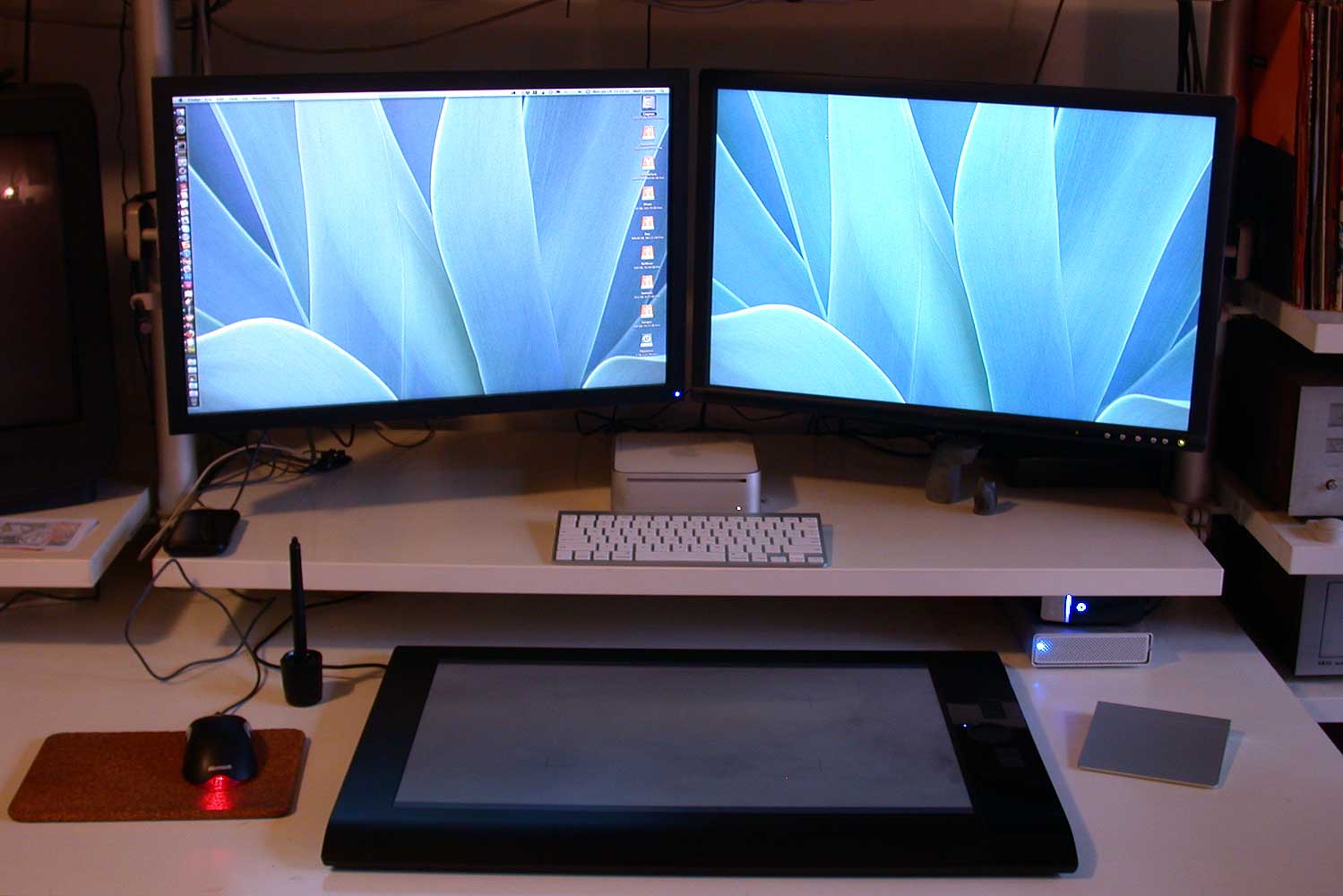
My working setp

With 2013 upon us, we’re in the window in which Apple CEO Tim Cook had promised that there’d be something new for Pro customers. Many people interpret this as code for a new Mac Pro which would in some way resemble the current behemoth.

I’m not so sure. I wonder if we’re in for an FCPX-style paradigm shift. Back when Apple introduced the first G3 PowerMac, there were two models of machine serving the Pro desktop market – the Powermac 8600, and 9600. The only difference was that one had three PCI slots, the other had six. The replacement G3 had 3 slots. Apple’s answer to those complaining, was to suggest that many of the previous two-card solutions had consolidated onto single cards, alleviating much of the need for six slots. Further, they suggested that the small fraction of the user base who needed more slots could go buy a PCI expansion chassis, which would plug into an existing slot and provide up to six more.

I hope we’re in for a similar shift on the Mac Pro.

(more…)


On Anvils and Axeheads

There’s a bizarre meme which seems to have cropped up in the technology journalism world, which can best be summed up as follows:

The iPad is a content consumption device, but has little value for content creation.

Now, if you look at Apple’s more advanced apps such as the iWork versions, iMovie, or the stunning new Garageband version, what you see very clearly, especially with Garageband, is that the iPad paradigm already does some things for content creation better than a desktop OS can. Application designers have only just begun to scratch the surface of what is possible, when freed from the necessary mindset of everything rotating around moving a single point focus-assigning dot around the screen.

The next extension of this meme seems to be that the iPad is poor for content creation specifically because there’s no programming tools on it – that in effect, you can’t create iPad software with an iPad. Some lament that this relegates the iPad to an ancillary role, forever enslaved to a desktop computer.

This argument has two main problems:

  1. So?
  2. Programs aren’t content, they’re tools.

I would argue that programming is not content creation. Content is what you make with programs. By way of analogy, consider a small village, in which you have a blacksmith, and a woodcutter.

The blacksmith uses his anvil to make axeheads, which the woodcutter then uses to cut down trees which both feed the blacksmith’s furnace, and produce rudimentary furniture. Is an axehead any less of a tool because it can’t make other axeheads? Is it any less of a tool because it can’t be used to make a hammer and nails to hold together the wood it cuts to make furniture? Do we think the axehead is a doomed or stupid tool because it can’t do these things?

Do we seriously want to use an anvil to cut wood?

The reality is that for most people, most of what they can, or would use computers to do can be done as well, if not better on an iPad. If your computing needs can’t be met by an iPad, then you’re probably not in the “most people” category. That’s something that never fails to amaze me – technical geeky types who are completely oblivious to the fact that their preferences for how technology should work are so far removed from what the general populace wants, that they can’t actually recognise that fact. You see it in tech journalism all the time, usually regarding Apple products.


iTunes Subscription Madness.

So the other day, Apple announced a change in their iOS developer rules that enables apps to have subscription billed content.

Anyone who reads a magazine app now has an Apple-mandated choice to subscribe and buy content wholly within the app. Yes, choice.

Now the tech blogosphere pundit-tards are losing their freaking minds because Apple mandated that consumers have a choice of how to subscribe, and whether they want to give their personal info to publishers. It’s easy to see why some companies like Rhapsody are looking at taking their bat and going home when you consider their sales plan:

  1. make a free app which acts as a reader / viewer for your content.
  2. Get your customers to download that app from the appstore, for which Apple will wear the hosting and bandwidth costs.
  3. Sell access to content yourself, keeping all the profits, while stiffing Apple with the expenses.

Yeah, that was going to work. Apple are idiots, you see. They’re a social-good commons that all people should be able to exploit for nothing while reaping the benefits, right?

Oh wait, that’s not what’s happening, is it? No, the way it works now is:

  1. make a free app which acts as a reader / viewer for your content.
  2. The customer chooses if they want to subscribe through your website, or internally within your App.
  3. If they buy in-app, the customer chooses if you get their personal details (which you sell to advertisers) or not.
  4. You keep 100% of revenue when you process the subscription on your site, Apple keeps 30% when it’s done as an in-app purchase.

Ironic really that pundit-tards scream about Apple locking down consumer choice, then when they actually come up with a policy that mandates consumers get a choice, it’s not the right choice. Rhapsody are talking legal action, yeah have fun with that, and many organisations are threatening to leave the platform.

Well, don’t let the door hit you in the arse on the way out. You see folks, what all these companies either fail to grasp, or are well aware of and weeping into their hats about, is a fundamental fact about what the obsession with design has meant for Apple:

Apple’s products are better at being what they are, than (any) developer’s apps or publisher’s content are at being what they are.

The iPhone is a better music player than Rhapsody is a music service. The iPad is a better tablet than the Kindle App is a book buyer/reader. For the vast majority of consumers, the Apple product experience is so much better than the competition that non-Apple “exclusive” software or content simply doesn’t enter the equation. This isn’t a matter of market abuse, monopolies or anti-trust, it’s a simple case that noone else has built a device that is close enough to being on par with Apple devices, that content availability is a factor in purchase decisions.

Why do you think the lack of Flash has meant bugger all to the vast majority of iOS users? Content is only king, if all other factors are equal.